What is Typography? Let's start with the definition: typography is the visual art of creating written words. Before the digital age, typography was a craft that was confined to print. Such as books and magazines. Now, the art of typography is used majorly in design. It is an essential piece of design because you need to know what your user is going to do and what is the end of goal of their experience with your product. Typography is utilized to draw the eyes of the human user to have a readable and enjoyable experience. If you were to use crazy color schemes, and font that was unpleasant or inconsistent with your design you could lead your audience away from your product entirely.
Learning and understanding every aspect of the anatomy of typography is essential if you want to be a stand out designer. That's why there is so much information out there about the subject.
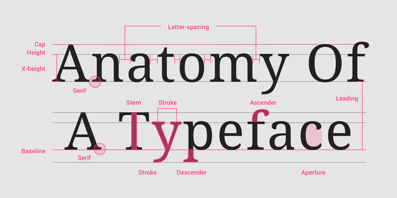
Here I have provided you with terms and defintions that will be useful to you as a designer:
Serif and sans serif are the two most common typeface classifications. Serif typefaces have a more traditional look. Sans serf typefaces became popularly in the late 19th century and are considered to be more modern.
An individual symbol of the full character set that makes up a typeface; may take the form of a letter, number, punctuation mark, etc.
A short line or stroke attached to or extending from the open ends of a letterform; also refers to the general category of typefaces that have been designed with this feature.
Literally meaning “without line”; the general category of typefaces (or an individual typeface) designed without serifs and embellishments.
The imaginary line on which the bottom of most letters and characters sit.
The imaginary line that is the top boundary mark for most letters and characters and for some lower case ascenders as well.
The uniform amount of spacing between characters in a complete section of text (sentence, line, paragraph, page, etc.).
The horizontal spacing between two consecutive characters; adjusting the kerning creates the appearance of uniformity and reduces gaps of white space between certain letter combinations.
The vertical spacing between lines of text (from baseline to baseline).
The part of a lowercase letter that rises above the main body of the letter (above the x-height) and typically extends to the capline.
The part of the letter that extends below the baseline.
The imaginary line that is the height of lowercase letters, regardless of ascenders or descenders.
Now that you understand the basic concepts and terms of typography you can take this information and apply it the project given on the Do It Yourself page of this website! Play around with fonts, learn the differences between them and remember to keep consistency throughout your design. When selecting typefaces and fonts, keeping it within the family or using two to three different ones helps to keep the readers attention. Don't make it to distracting for the eyes unless you are wanting to lead your user to certain aspects of your website. Play with heirarchy and find your own unique styles to create the best user experience possible while also meeting your objectives within your projects.